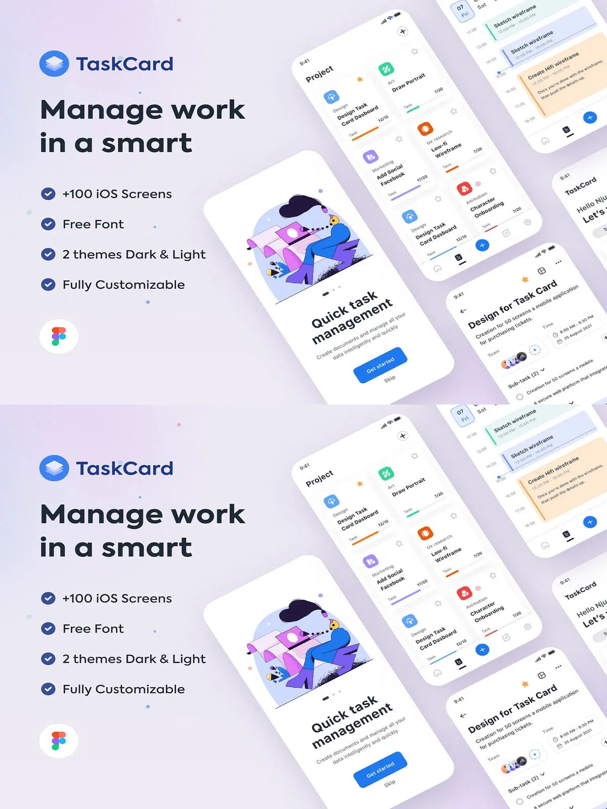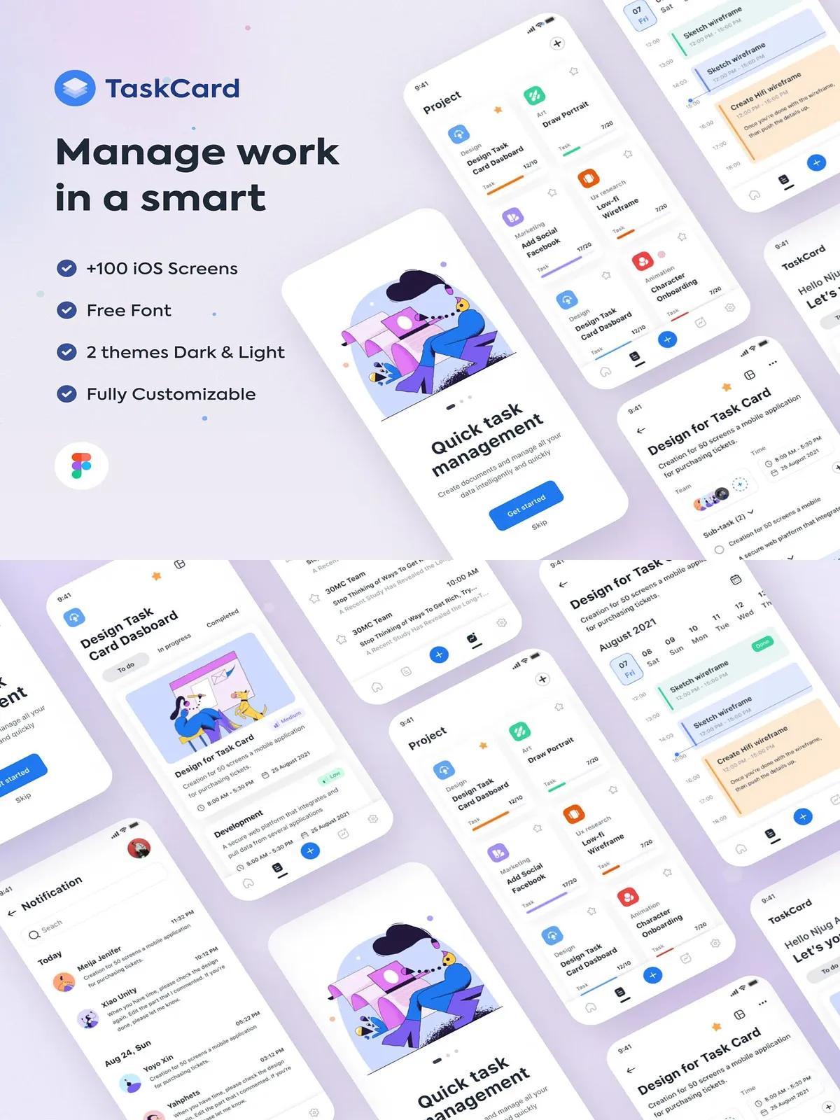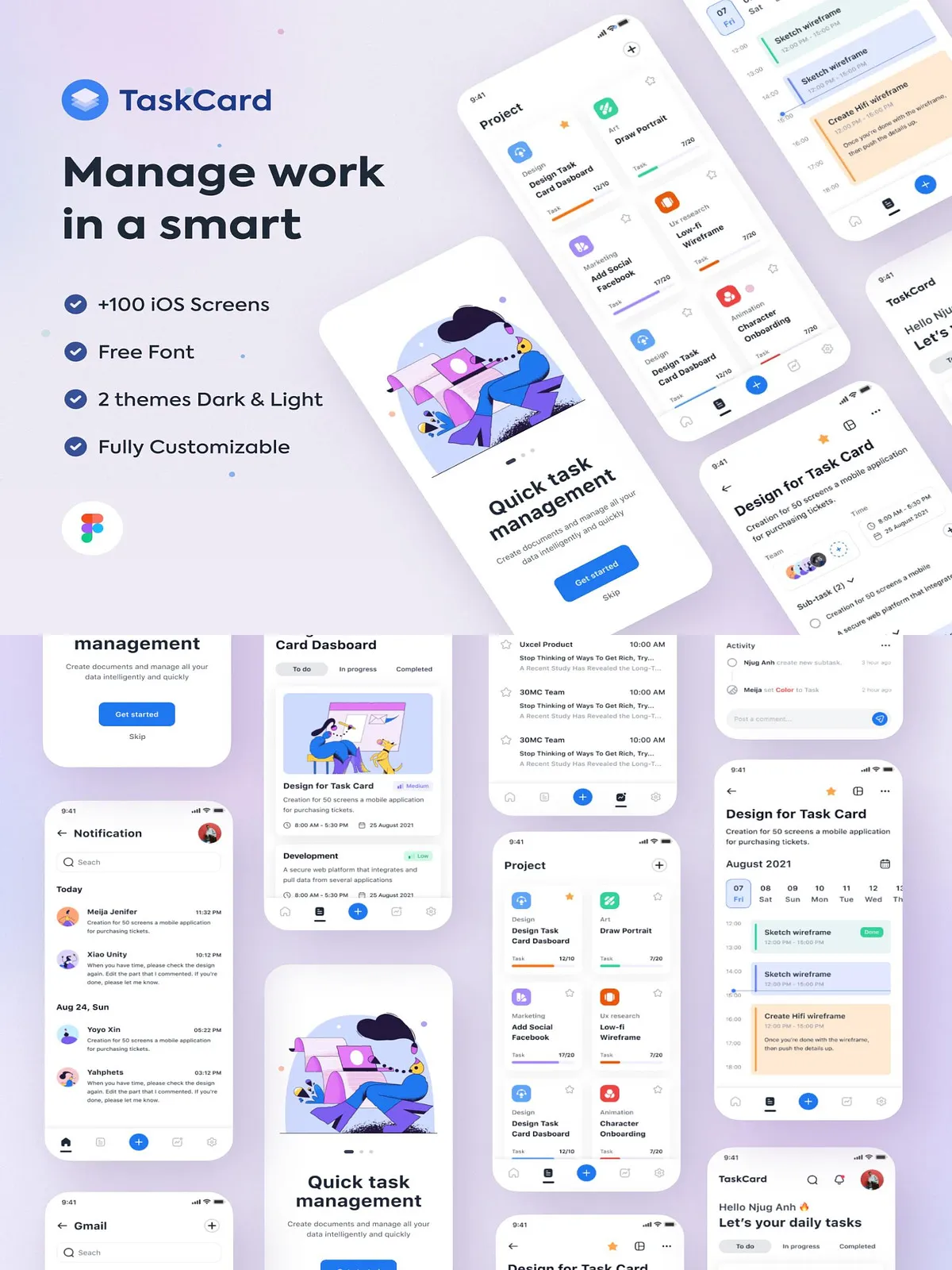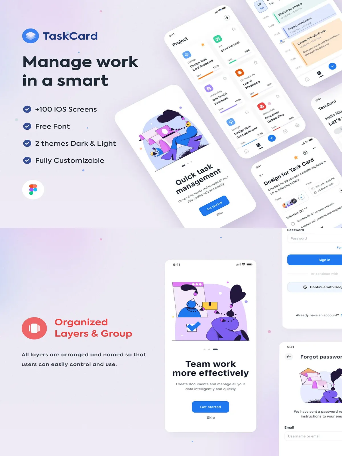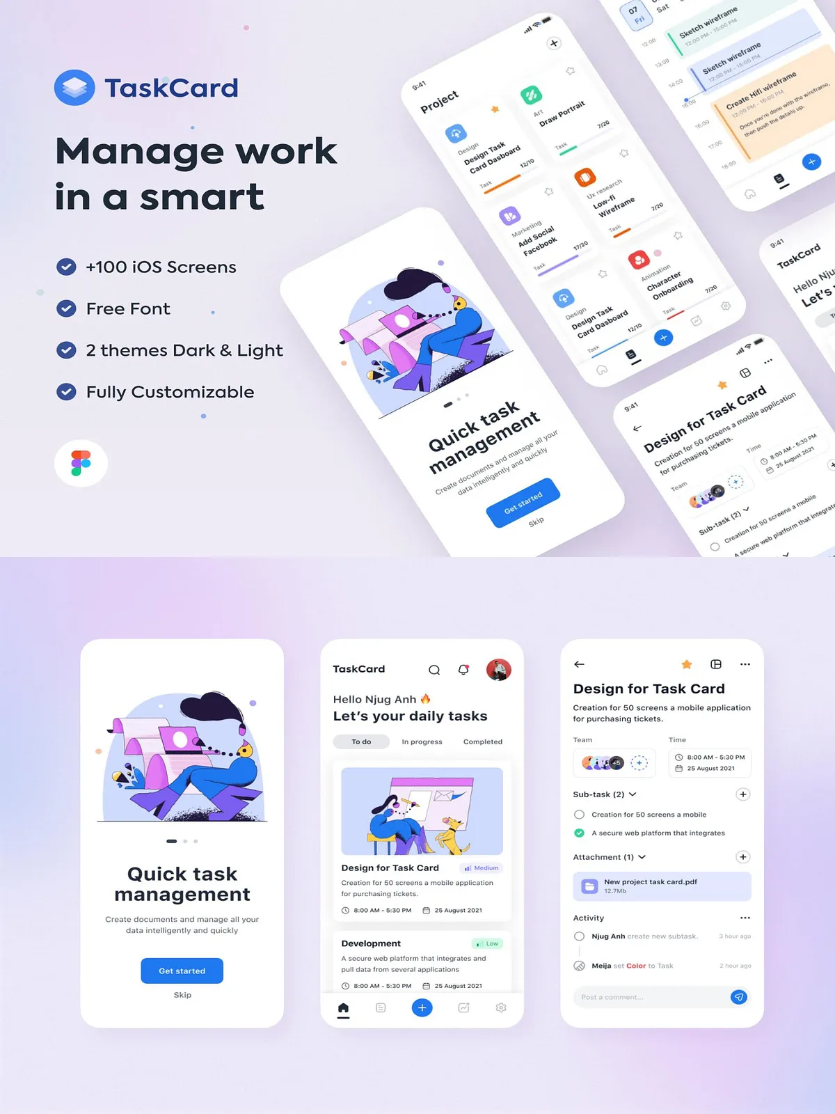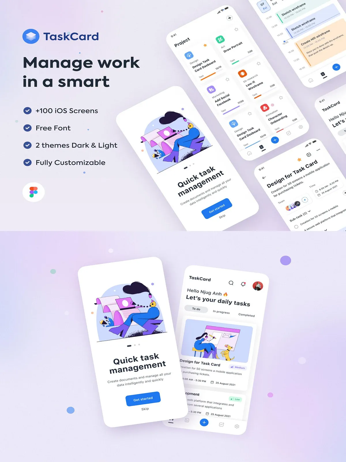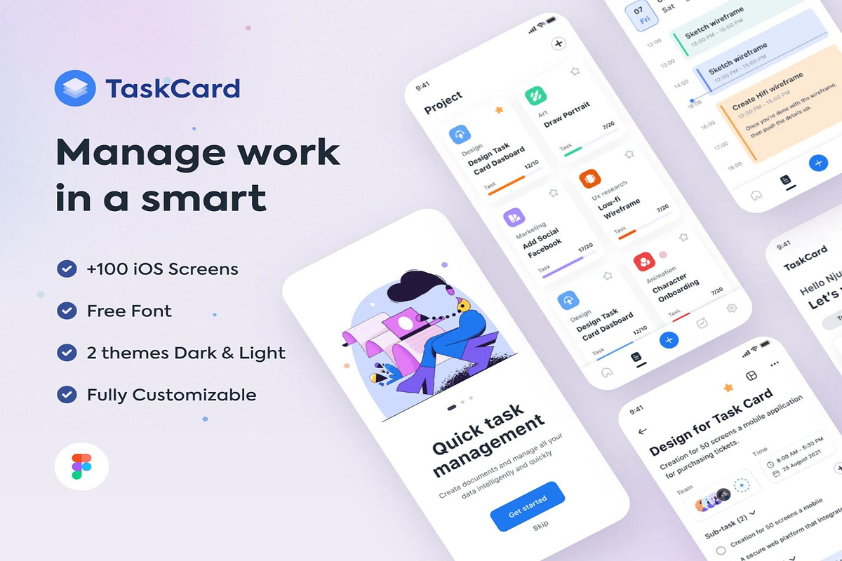
Task Card is a proactive application template built for management teams and product designers who demand clarity, reliability, and speed. This template presents a polished UI system that helps managers track responsibilities, assign work, and monitor progress without friction. Task Card captures every thread of activity and surfaces the most relevant tasks so teams never miss deadlines or lose context. Designed and delivered in Figma, the template provides a ready-made interface that you can deploy, adapt, and iterate on immediately.
Key Features
Comprehensive screens and adaptive visual modes
- 100+ Screens: A full suite of more than one hundred screens covers onboarding, dashboards, task threads, detailed task views, user profiles, settings, notifications, and administrative panels—allowing teams to model real-world workflows without building from scratch.
- Light & Dark Versions: Ship both light and dark themes to accommodate user preferences and extend accessibility. Each view translates cleanly between modes so visual hierarchy and legibility remain consistent.
- High-Resolution Layouts: Designed at 390 x 844 px (iPhone 13 resolution) to mirror modern mobile constraints and to ensure pixel-accurate handoffs for engineering.
- Full Customization: Every component and symbol is editable. Replace colors, swap typography, adjust spacing, and reconfigure components to match your brand system quickly.
- UI Guidelines Included: Follow ready-made guidelines for spacing, typography, color tokens, and component states to maintain consistency across your product and speed up implementation.
- Weekly Updates: The template receives regular updates to refine interactions, add screens, and keep patterns aligned with current UX best practices.
- Figma Format: Delivered as a structured Figma file with organized layers, components, and auto-layout usage to accelerate prototyping and handoff.
Why Choose Task Card
Designed to reduce cognitive load and increase execution
Task Card focuses on clarity and action. The interface prioritizes active items and surfaces overdue tasks, upcoming deadlines, and high-priority threads so managers can act immediately. By consolidating threads into clear lists and card-based detail views, the template reduces context switching and helps teams commit to actions faster. Designers and product teams will value the modular components that let them assemble new flows without recreating core patterns.
Included Assets
Everything you need for design and handoff
- 100+ prebuilt mobile screens covering core user journeys
- Light and dark theme variations for each screen
- Comprehensive UI kit with buttons, inputs, toggles, tags, and badges
- Component library using Figma components and variants
- Typography scale and color palette with token naming
- Interaction notes and proposed micro-interactions for prototypes
- Export-ready assets and icons optimized for mobile delivery
How to Use
Quick setup and practical workflow
- Open the Figma file and duplicate it into your workspace to begin editing securely.
- Follow the included UI guideline page to set your brand colors and typography tokens; these will propagate across components.
- Customize screens by replacing placeholders, adjusting copy, and mapping your user roles to the UI flows.
- Prototype interactions using Figma prototyping controls to validate UX flows with stakeholders or users.
- Export assets and hand off specs using Figma Inspect or your preferred design-to-dev tooling for quick implementation.
Best Practices & Customization Tips
Optimize for collaboration and scalability
- Define global color tokens and component variants up front to speed future changes and maintain consistency.
- Use the provided UI guideline pages to document component usage and state behavior for developers.
- Leverage auto-layout and constraints to make responsive adjustments faster when adapting to other screen sizes.
- Maintain a single source of truth file for brand tokens and distribute working copies for feature-level experimentation.
Support & Licensing
Delivery and ongoing assistance
The Task Card package includes the Figma source file and a concise guide explaining file structure and component usage. Licensing typically allows integration into your projects and internal use; check the included license file for commercial terms and redistribution limits. If you need assistance, update notes and support links are provided within the file so you can request clarifications or report issues. With weekly updates, you can expect refinements that keep the template aligned with evolving UX standards.